
By Chris Goldsworthy & Danny Luo, Github Project Repo
For my blog post on my HackOn(Data) experience, click here
For the video of our presentation, click here
A solution for determining the most optimal placement of location-based wayfinding-information maps throughout Toronto. Third place at HackOn(Data) 2016.
Chris Goldsworthy and Danny Luo are third-year students at the University of Toronto who have known each since first year. They both happened to be participating in HackOn(Data) - after realizing this, they decided to work together. Because of their background in computer science and math, they had a good grasp of the basic tools needed to complete data science related tasks. Their mentor, Ryan Garnett, is a geographist who works for the City, specializing in curating and using geospatial datasets.
With the guidance of their mentor Ryan and their preparation over the week preceding the final event, Danny and Chris created a model to find the optimal placement for the wayfinding maps. They enjoyed listening to the various speakers at HackOn(Data) and were able to meet similar-minded data enthusiasts.
The City of Toronto wants to place wayfinding maps throughout the city in order to indicate landmarks or attractions within a certain area surrounding the map (i.e. a five minute walking radius). Therefore, it is important to determine what the most optimal placement of the maps are, as well as determining which maps are more valuable compared to other maps (i.e. ranking them based off their importance).
We decided to work on this project because it was open-ended and required the use of unsupervised learning. It also required additional datasets to augment the original dataset provided by the City, in order to derive conclusions about the importance of individual maps.
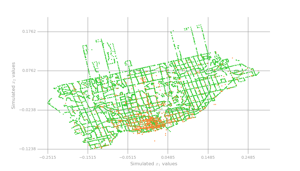
We were first given the cultural landmark dataset which consists of properties labelled by the city as being available for use for any kind of cultural event. Due to the small size of the dataset, we decided to use a Jupyter notebook to do the main analysis (below: cultural landmarks in orange, transit stops in green for reference).
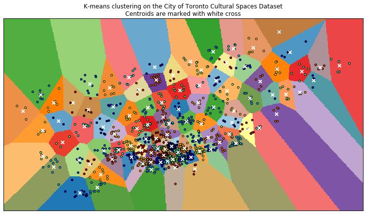
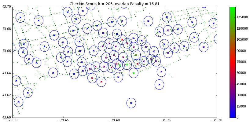
Our initial idea was that we should seek to cluster cultural landmarks together. The centroid of each cluster could then be an approximate location for placing a billboard map. K - Means lends itself to this task very well. However, one important question was how many centroids should be chosen (i.e. how many maps should be placed in the city). We had wanted to frame this in terms of an optimization problem, but we struggled to devise a clear-cut loss metric during the final event. Therefore, we decided to create a loss metric based off the overlap of the area surrounding each map - we defined this area to be anywhere within a five minute’s walking distance of each map. We then chose to place approximately 200 maps, based on this overlap penalty and visual inspection (this is an issue of concern and is addressed below in “Improvements for our Model”).
We visualized the results of the K - Means clustering in the next figure, in which we divided the city according to which cluster it belonged to.
Next, we wanted to determine which maps are the most valuable and rank them accordingly. There are several ways to determine which maps are the most valuable, but intuitively, it can be framed as areas with:
After framing the problem this way, each map can receive a score for each criteria above:
To compute these scores, we first mined checkin data off of Foursquare using a grid search (this was done on Databricks using a notebook). The collected checkin data can be see below:
We then ranked the maps based on the number of Foursquare checkins in the area surrounding the map.
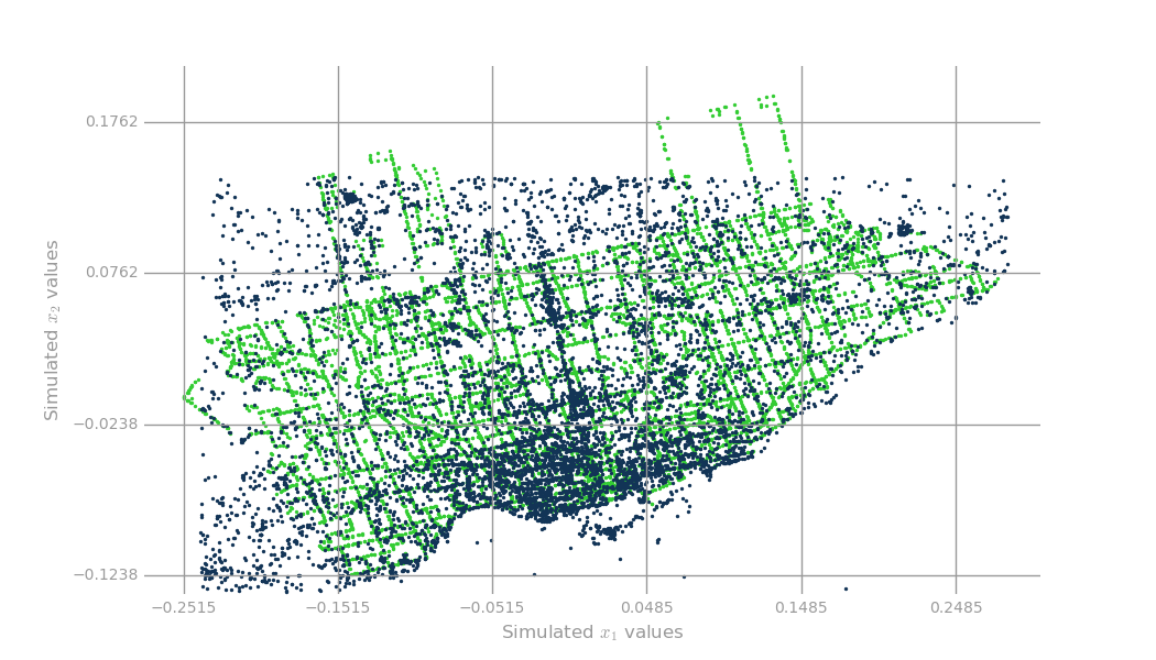
Using the City of Toronto transit stop dataset, we ranked the maps based on their proximity to transit stops in the graph below.
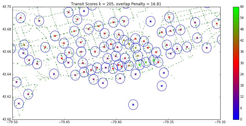
We normalized the scores based on their z-score to put them all on the same scale. Finally, we computed the overall score using a weighted sum of the three scores (“Final Score”).
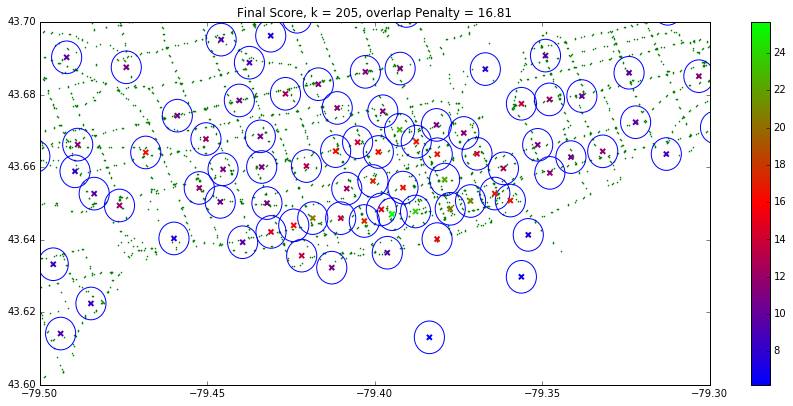
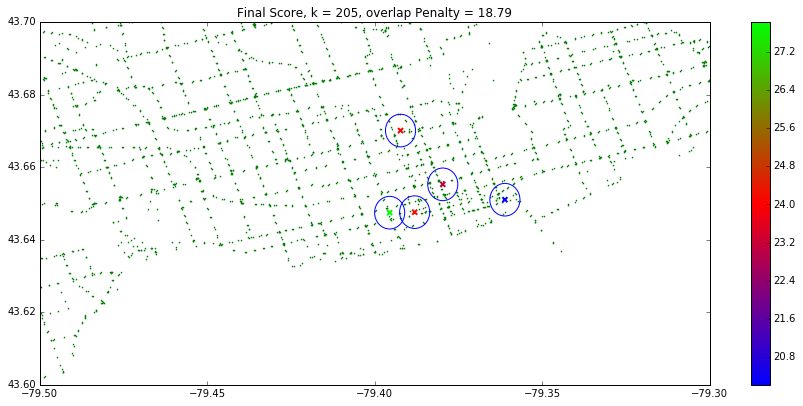
The top five of these maps using the weighted score can be seen below:
Run the original Jupyter notebook in the Github repo to see an interactive display of the placements using mplleaflet.
Our first major improvement would be to make a formal optimization problem. This would allow us to make a problem that’s can be suitably solved using machine learning. This was difficult to implement given our time constraints and the open-endedness of the challenge. Making our problem suitable for solving by machine learning methods will also involve removing as much human bias from our model as possible. The weights in our final score were chosen rather arbitrarily and is a major source of human bias. Creating a simpler, more transparent scoring technique may solve this. A simpler solution could be, for instance, just looking at one score (e.g. area popularity) and forming an optimization problem based off that. Also, instead of placing maps in the middle of a cluster, which could be anywhere, we can simply place maps at the nearest major intersection.
After producing a reasonable model based on k-means and popularity scoring, our partners from the City of Toronto can use our results to help them determine optimal map placements. Naturally, there are many factors that are involved with such a project that are not represented in the data, such as the equal distribution of maps amongst the city wards. Thus, our model must be used with discretion.
More generally, our analysis can be used to determine hotspots over Toronto for various business purposes. If we were able to obtain combined demographic and location data from social media data, businesses could make more informed decisions to reach out to certain audiences. In conclusion, our model is broad and contains many different possibilities for further specialized uses, both in government and in business.
The code used to create some of these images, as well as mining data off of Foursquare, can be found here.
The code used to compute the location and ranking of the maps can be found in the github repository.